Step back in time and relive THAI’s evolution through its three iconic logos — symbols that transcend beyond a decoration on an aircraft’s tail. The three elegant insignias have served as a testament to the graceful heritage and cultural essence of Thailand for 65 remarkable years, and each has been an enduring expression of national pride that soared across the skies, communicated to the world a reflection of Thailand’s rich identity.
1960
THE DANCING MAN: THE INAUGURAL LOGO THAT BROUGHT A NATION’S SPIRIT TO THE SKIES
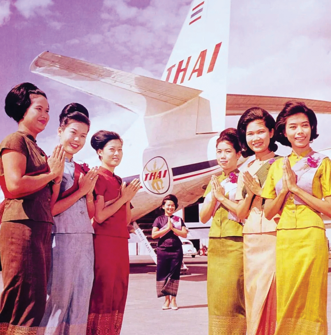
On March 29, 1960, Thai Airways International (THAI) introduced its inaugural logo “The Dancing Man”, an elegant figure behind the wordmark THAI. It conveyed the nation’s rich heritage and spirit well, with each letter representing a core element of the airline’s identity: “TH” for Thai, “A” for Airways, and “I” for International— and also culminating in an uncompromising promise of world-class excellence. Designed by renowned Thai fashion designer HSH Prince Kraisingh Vudhijaya (1929-1976), who also designed the first cabin crew uniforms, this was the logo used for the airline’s early appearances on regional flight paths.
![]()
1975
A MODERN LOGO AS THAI TOOK TO INTERNATIONAL SKIES
For over fifteen years The Dancing Man served as a poised emblem of the nation’s heritage and spirit. Yet, with the aviation industry entering a dynamic era of rapid expansion globally, THAI embraced a pivotal transformation in readiness for its debut on the international stage — including a new visual identity to meet the expectations of a modern, global audience.
In May 1975 this evolution took flight when a new logo was unveiled that was conceived by highly-regarded Walter Landor & Associates, renowned for their visionary design ethos. The agency reimagined THAI’s image while preserving the essence of its cultural roots, resulting in a modern logo that married subtle details of Thai aesthetics with aerodynamic lines evoking effortless flight. Beyond its form, the modern logo’s color palette spoke volumes:
![]()
• Gold, inspired by the radiant splendor of Thailand’s palaces and temples, to embody opulence, dignity, and timeless prestige.
• Fuchsia to echo the delicate yet vibrant Elephant Orchid, Thailand’s national flower and a symbol of natural grace.
• Magenta to pay homage to richly textured Thai silk, a fabric interwoven with the soul of Thai crafts and culture.
This rebranding marked more than a visual refreshment. It was a declaration that THAI was now positioned not merely as an airline, but as a cultural ambassador of the nation: contemporary yet rooted in heritage, cosmopolitan yet unmistakably Thai. The emblem soared across skies for decades, the distinctive symbol of a nation making its mark with authenticity and sophistication on the global stage.
2005
A STANDING AND REPUTATION EMBODIED IN A REFRESHED LOGO
In the three decades since its transformative rebranding in 1975, the THAI logo transcended borders and continents to become iconic — instantly recognizable, deeply evocative of Thainess, and seamlessly aligned with the stature of a global airline. Yet, true to THAI’s spirit of continuous refinement and reinvention, the evolution of the airline’s brand identity did not end there. In response to the shifting landscape in the sector and beyond, THAI entrusted global branding consultancy Interbrand Singapore with the task of refreshing its identity for a new era in international aviation. The result was a refreshed, vibrant logo that introduced dimensionality and more vivid tones, while remaining rooted in brand essence. This new logo was grounded in three pillars that still define THAI’s experience promise to its passengers:
![]()